July 2026 Newsletter

Updated: Sep 15
Each month, we share resources, activities, events, and opportunities for connection with FBEN members. Preview our July 2026 issue below, or, for an interactive version, view this email as a webpage.
Interested in receiving our emails? Join FBEN!
JULY 2026
Hi Farm-Based Education Network,
The days are long, the veggies are plentiful, and we’re preparing to harvest a few "crops" of our own: projects that have been growing for a long time and require your input to help them ripen.
Will you present at the Gathering? Shelburne Farms will host the 2026 Farm-Based Education Network Fall Gathering October 18–20. Do you have a favorite farm game to teach? A beloved program that you are excited to share? A farm friend who has been shaped by your work and is looking to share their story? Fill out the request for workshop proposals by 7/31!
Will you contribute to The Case for Farm-Based Education? We’re writing “The Case,” which includes 10 reasons why farm-based education is critical work. We can’t make this document without you. Email me with compelling, research-backed, and essential reasons you think we should include.
Do you offer internships/fellowships/career opps? An FBEN member is hoping is to build an extended immersive experience (9 months to a year) for participants to feel out whether farm-based ed is the right career for them. Share links, info, and your email if you’re willing to discuss your experience with this member.
You all make this network work. Thanks for being here and for sharing your expertise. Happy summer!
Vera
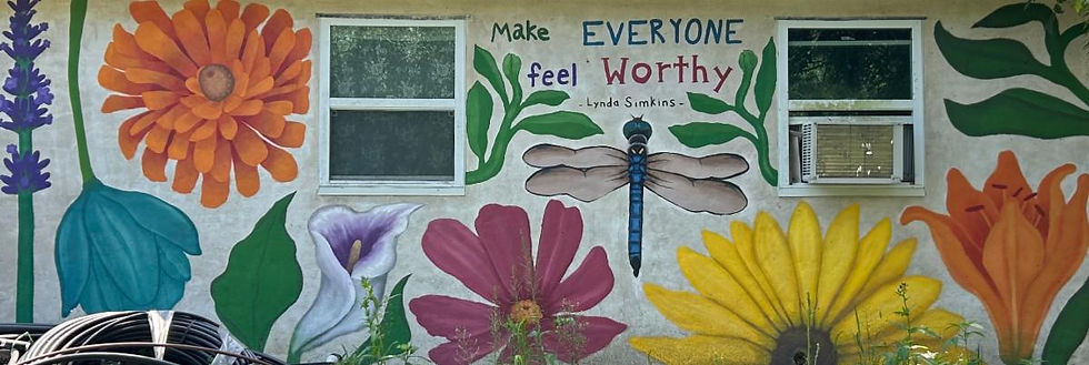
Photo: Mural at Natick Community Organic Farm in Natick, MA by Auden Akinc. Auden was involved with Natick as a camper, and now as an artist!


Có lần mình đang lướt mạng thì thấy mọi người nhắc khá nhiều đến S8 chủ yếu xoay quanh các thông tin thể thao trực tuyến. Thấy cũng khá tò mò nên mình bấm vào xem thử giao diện bên trong có gì. Mình không ngồi đọc kỹ từng phần mà chỉ kéo qua một lượt, để ý cách chia mục và bố trí nội dung. Nhìn chung, các khu vực được sắp xếp khá gọn, phần nào ra phần đó nên lúc xem nhanh cũng không bị rối. Mình thường chỉ cần tìm những thông tin cơ bản nên cách trình bày như vậy khá vừa ý, không phải mất nhiều thời gian để dò từng mục.
Sau khi thấy XOSO88 được nhắc tới, mình vào xem thử cho biết. Mình chú ý nhiều hơn đến cách sắp xếp giao diện thay vì tìm hiểu các tính năng bên trong. Các nội dung được đặt theo từng khu vực, phần menu cũng khá trực quan. Nhìn chung lúc kéo xuống xem không bị quá nhiều thông tin chen chúc. Bản mobile cũng cho cảm giác tương đối dễ sử dụng.
Mình có ghé qua LOTO188 để xem thử sau khi bắt gặp tên này trên mạng. Mình không dùng lâu mà chủ yếu quan sát cách trang trình bày thông tin. Giao diện nhìn khá thoáng, từng khu vực được sắp xếp tương đối dễ hiểu. Menu nằm ở vị trí dễ nhận biết nên muốn chuyển sang mục khác cũng không mất nhiều thời gian. Thử mở bằng điện thoại thì cách hiển thị vẫn ổn, thao tác không có cảm giác bị vướng.
Some articles compel me to slow down because the subject matter is rather sensitive, and content regarding the grief of losing a pet is one such instance. Previously, I had encountered the topic LV88 of reward-based card games—often associated with leisure and passing the time. Placing these two subjects side by side, I realize that each situation calls for a distinct approach. The section discussing how to cherish memories and allow oneself to grieve is written with great restraint, avoiding the trap of offering hollow words of encouragement.
Vừa mở TK88 lên là thấy giao diện kiểu đồng bộ thật, bấm qua lại không bị lệch nhịp hay phải đoán xem nút nằm đâu. Nội dung cũng chia thành từng khối rõ ràng nên lướt nhanh vẫn nắm được ý chính, không bị ngợp chữ. Mình thích cái cách họ viết kiểu “ăn khớp” ngay từ đầu, đọc vài dòng là hiểu họ muốn hướng tới trải nghiệm liền mạch chứ không màu mè. Kéo xuống thấy các tiêu đề và box tách bạch, nhìn phát là biết phần nào là nội dung chính, phần nào chỉ là thông tin kèm theo.